NHL Thread Because There Isn't An NHL Thread

my initial thoughts:

Impressive:
Nordiques and Whalers - well done on obvious classics.

Happy Surprises:
Jets on the grey jersey. I didn't think I would like it based on the mock-up.
I also thought that 'yotes and Flames would be too kitschy but they seem to have aged better than I though.

Disappointments
Stars - why the excessive white trim around the letters on grey?!
The Ducks...right down to the Disney-fied "C"...yuck this did not age well. Also prefer the original green with higher contrast between the duck and the field.
Canucks - that gradient...didn't like it with red, don't like it with green. Gradients don't look great on hockey uniforms IMHO.
1605542911591.png
Penguins - would have liked to see this on Blue or Black. Something's missing and I can't put my finger on it.
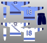
1605542851351.png1605542886234.png

Everything else didn't rock me one way or another.
 
Yeah, the logo is a bit big. Even on their standard jerseys now they wanted the logo to be bigger than average, though it doesn't look comically large like these.

Also the Islanders jerseys are...regular jerseys, with slightly darker blue? What's the point?

Avs with the fleur-de-lis look great in that colour scheme, though if I were a Nordiques fan from Quebec City I'd probably be annoyed!
As a die-hard Wings fan, I cannot in good conscience like that Avs Jersey. Though I do appreciate the throwback to the Nords and wish they'd just move back to Quebec so I can like the jersey design and fleur de lis :)
 
As a die-hard Wings fan, I cannot in good conscience like that Avs Jersey. Though I do appreciate the throwback to the Nords and wish they'd just move back to Quebec so I can like the jersey design and fleur de lis :)
When I was a kid my second favourite team alternated between the Avs and the Wings because apart from Pavel Bure, who I rarely got to see since he was in Vancouver, my favourite players were Joe Sakic and Sergei Fedorov. Those late '90s/early '00s playoff series were amazing to watch as a somewhat-neutral fan!
 
When I was a kid my second favourite team alternated between the Avs and the Wings because apart from Pavel Bure, who I rarely got to see since he was in Vancouver, my favourite players were Joe Sakic and Sergei Fedorov. Those late '90s/early '00s playoff series were amazing to watch as a somewhat-neutral fan!
Agreed! Both players were great. And Federov did things with a stick that were just magic.

I used to keep a Claude Lemieux Avs jersey to use as a front door mat during playoffs season. If you wanted to come in my house you HAD to wipe your feet on it :)
 
my initial thoughts:

Impressive:
Nordiques and Whalers - well done on obvious classics.

Happy Surprises:
Jets on the grey jersey. I didn't think I would like it based on the mock-up.
I also thought that 'yotes and Flames would be too kitschy but they seem to have aged better than I though.

Disappointments
Stars - why the excessive white trim around the letters on grey?!
The Ducks...right down to the Disney-fied "C"...yuck this did not age well. Also prefer the original green with higher contrast between the duck and the field.
Canucks - that gradient...didn't like it with red, don't like it with green. Gradients don't look great on hockey uniforms IMHO.
View attachment 75063
Penguins - would have liked to see this on Blue or Black. Something's missing and I can't put my finger on it.
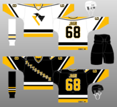
View attachment 75060View attachment 75062

Everything else didn't rock me one way or another.
Agreed on the Stars, MIghty Ducks and Canucks. I actually like the Pens unis but maybe I'm biased 😅
 
my initial thoughts:

Impressive:
Nordiques and Whalers - well done on obvious classics.

Happy Surprises:
Jets on the grey jersey. I didn't think I would like it based on the mock-up.
I also thought that 'yotes and Flames would be too kitschy but they seem to have aged better than I though.

Disappointments
Stars - why the excessive white trim around the letters on grey?!
The Ducks...right down to the Disney-fied "C"...yuck this did not age well. Also prefer the original green with higher contrast between the duck and the field.
Canucks - that gradient...didn't like it with red, don't like it with green. Gradients don't look great on hockey uniforms IMHO.
View attachment 75063
Penguins - would have liked to see this on Blue or Black. Something's missing and I can't put my finger on it.
View attachment 75060View attachment 75062

Everything else didn't rock me one way or another.
Agreed on the Canucks. They're probably the worst of the whole lot. They even have great retro jerseys and logos they could have gone back to. And the Ducks should have used the original logo; the Darkwing Duck is terrible, at least on white. (Or they should have used the original movie's jerseys, if they were allowed.)
 
Haha - I'm actually a displaced yinzer and was hoping for a classy update to robo penguin
I hated the pigeon with a passion so I'm glad they went with the triangle-free version of the Pens modern logo as a shoulder patch.
 
Last edited:
The Ducks is pretty painful, but overall there’s nothing I violently dislike. Must have been a sale on red jersey material though.
I like the Ducks jersey. I wish they would just go back to their original logo and dump the current.
 
Yeah, not so enthused about the Canucks jersey. I was hoping they would go with the blue and green in the 90's skate logo, or even the early 80's deep V. Oh well.

Love the Capitals and Jets jerseys, though.
Yeah I feel like the Canucks really missed the mark on this one. #MissedOppportunity
 
You can’t order blanks?
According to ESPN but nothing on blanks.

"These jerseys are going to be worn a limited number of times during the 2020-21 season only, and are "while supplies last" as far as retail sales. The Adidas reverse retro jerseys will be available Dec. 1 for $180-$225 in the U.S. and $200-$250 in Canada on Adidas and NHL online retail sites, and then at additional retailers starting Dec. 6."
 
Back
Top